Many fashionistas are afraid to choose an image that combines more than three colors, the rest are at risk, often making annoying mistakes.
In fact, correctly combining the colors of clothes and accessories is much easier than it seems at first glance. Fortunately, color harmony obeys the laws, which it is advisable to familiarize yourself with for everyone who has difficulty choosing colored clothes.
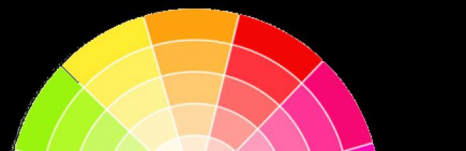
The basics of color science are based on the theory of the "color wheel", which represents all the colors visible to the eye.
Color matching by contrast is one of the winning options. Considering that this is a circle, draw a line-radius through the center of the circle, for example, from green - and it will lead you just in time for the color of fuchsia. This will be the optimal contrast combination.

If you are afraid of the brightness of the contrast, choose deaf or pale shades. When choosing contrasting colors, it is advised to take them not in equal proportions. For example, a suit in dark shades, and red - only a scarf, collar or handbag.
One of the most difficult combinations is an achromatic color palette, when an image is built around black, white or gray, without using other colors.
 |
 |
A more reliable combination in a combination of colors of clothes is a harmonious combination. This combination is the most pleasing to the eye, these are the colors, as it were, passing into each other, devoid of contrast and challenge.
How to match colors in clothes
There are six basic color combinations. Each of them can give an infinite number of different color palettes.

Take the following combination options for the base: monochrome, complementary and triadic.

- With monochrome, consisting of colors of one sector of the circle, combine several shades of the same color.
A monochrome combination can be diluted with a neutral color. Nearby colors on the wheel are perfectly combined and produce a harmonious and pleasant impression. - With complimentary, where two opposite colors are used in the circle, choose tones that beautifully set off each other and give the color a "play".
A split complementary scheme is a scheme in which one of the opposite colors is replaced by two adjacent colors on a circle. - With triadic A combination of three equally spaced colors on the color wheel is chosen.
Primary scheme It is a combination of the three primary colors (red, blue and yellow).
secondary scheme is a combination of three secondary colors (orange, green and purple). They are obtained by mixing primary colors (red and yellow make orange, yellow and blue make green, and blue and red make purple).
Tertiary scheme is a combination of three equidistant tertiary colors (red-orange, orange-yellow, yellow-green, green-blue and blue-violet). They are formed by mixing primary colors with secondary ones.

By simplifying it to 12-16 shades, you can more accurately determine the options for approximate combinations. Such a color wheel is convenient for selecting harmonious color combinations from 2, 3 or 4 colors. In each example, the lines connecting different colors can be mentally rotated in a circle, getting new combinations.
| 2 opposite colors: combination with high contrast. | 3 colors: classical triad, colors arranged in a triangle. | 3 contrasting colors: two colors are almost related, one is contrasting. |
 Red+Green |
 emerald green+yellow-orange+purple cobalt blue + light green + orange azure blue+lemon+red blue+yellow+pink |
 Example: green + yellow + pink. |
| Very close variant: 4 colors: 3 related and 1 contrast. |
3 related colors: weak combination. | 4 colors: two mutually reinforcing. |
 Example: yellow + blue + purple + pink. |
 Example: lilac + shades of pink. |
 Example: blue + salad green + pink + warm beige instead of orange. |
Examples of color combinations in clothes
Consider the color wheel, color combination schemes and simple examples.
Combination of analog colors - soft, calm combination of three neighboring colors of the spectrum. Choose the main, complementary and accent tone, be sure to use shades of color that are different in brightness.

A combination of opposites(complimentary) colors. According to color theory, each warm color is harmoniously combined with the cold opposite to it. These pairs are easy to identify using the spectral circle (color wheel).

The combination of combined complementary colors - a less contrasting variant of the combination of opposites. Such a scheme, when one color is combined with two opposite, close to each other, is perceived by the eye more harmoniously.

Classic triad - a combination of a combination of 3 colors that are located at the same distance from one another (at the vertices of an equilateral triangle). It is also worth choosing one dominant color, and the other two - shading and complementing the main one.

Rectangular pattern combination consists of two pairs, each of which contains the opposite color and its corresponding analog. This option is more diverse, but requires precise balance between the primary and secondary colors.

Color harmony is not limited to 4 color combinations. A hexagon can also be inscribed in the color wheel, the vertices of which will indicate extended color harmonies. Bright, juicy color combinations can be diluted with universal ones - black, white, gray and beige. This good way expand the color range without the risk of overdoing it and becoming like a rainbow.
Color saturation
The color may be lighter or darker. In other words, the color has saturation. To show saturation, the color wheel has several rings; two large rings for dark shades and two small ones for light ones.

Each color can be used in varying degrees of intensity. In the color wheel below, each color is divided into 6 rows - from light pastels to muted, in the middle - bright and pure colors.
The most contrasting combinations will be:
1. Bright colors.
2. Pastel and muted colors.
3. Pastel and muted shades of the same color.

Combinations with weak contrast.
1. Between pastel colors.
2. Between muted colors.
3. Between shades of the same color, close to each other in saturation.
You also need to remember that color induction is of great importance for visual perception, i.e. change in the characteristics of one color under the influence of another. If dark and light colors are placed side by side, then the dark will appear darker, and the light - lighter.
According to www.myshulka.ru, maxlozovski.com, dresshelp.ru
By the way, you can print (or draw: o) a color wheel, throw it in your purse and go shopping!
In moments of uncertainty, remember the color wheel and the basic laws of color harmony, the rest of the time - trust your intuition and inspiration!
Good luck to you!
Color circle is the ABC and the foundation for those who want to touch creativity and design. This tool was developed by I. Itten to help beginner artists. Thanks to such a simplified model, it is very convenient to learn the rules for the harmonious combination of colors. At the heart of the circle are three colors: red, blue and yellow - our foundation. All the rest are obtained by mixing them: the union of red and yellow gives orange; yellow with blue - green; blue with red - purple. Such colors are called secondary. Then red and orange are mixed - in total, red-orange is obtained; yellow with orange - yellow-orange; yellow with green - yellow-green, etc. These will be tertiary colors.
Consider also color characteristics.
 In the center of the circle are pure, true colors, the colors of the rainbow. These spectral colors are not diluted with any other color, not mixed with anything ( Hue/Pure Colors). For example, for red this is the number 4, for orange 20, for yellow 36, and so on along the radius. Further, white gradually begins to be added to them, the concentration of which gradually increases. The more white that is added, the more each color is washed out. For example, red through floral shades goes into pale pink - this is how we get shades ( Tint). Further towards the number 3, gray begins to be added to the red. Red through berry, wine, chocolate shades goes to coffee - a tonality is formed ( tone). When adding black to pure colors, we get a shadow ( shade),
so pure colors will become darker.
In the center of the circle are pure, true colors, the colors of the rainbow. These spectral colors are not diluted with any other color, not mixed with anything ( Hue/Pure Colors). For example, for red this is the number 4, for orange 20, for yellow 36, and so on along the radius. Further, white gradually begins to be added to them, the concentration of which gradually increases. The more white that is added, the more each color is washed out. For example, red through floral shades goes into pale pink - this is how we get shades ( Tint). Further towards the number 3, gray begins to be added to the red. Red through berry, wine, chocolate shades goes to coffee - a tonality is formed ( tone). When adding black to pure colors, we get a shadow ( shade),
so pure colors will become darker.
And so is every shade. Each ray is a stretch of one color from its lightest shade to its darkest shade.
This is the concept of the color wheel. The rules for the harmonious combination of colors are the same for a cold and warm palette.
RULES FOR HARMONIOUS COMBINATION OF COLORS

Rule number 1. Monochrome harmony (a combination of shades within one color ray)
Inside one ray, we can use any shades. Despite the fact that only one color is used here, creating a truly stylish set based on monochrome harmony is quite difficult. You need to be able to use the shades skillfully and not turn interesting idea in a dull or rough manner.
For example, we can take black (it, as well as white and gray, is achrome, it is not taken into account in color combinations as another color, and is combined in theory with all colors) and red. It would seem that everything is according to the rules, but it turns out to be a very aggressive and rude combination that will suit units. Or you can take a few light shades orange and we get a rather pale and boring picture ...
Hint: If you want the set to look original and not boring, “play” with the texture of fabrics, combine different ones together, and then you will get a very fashionable and stylish look.
Example: chocolate pants + rose petal blouse or chocolate + raspberry; dark blue (jeans) + light blue (knitwear).
And this is how, using monochrome harmony, Blair Eadie combines colors in her image.

Rule number 2. Opposite harmony (a combination of shades inside the rays located opposite each other)


In this combination, the main rule is accuracy and the correct dosage. If we create an image based on this harmony, then we use the following tips:
1. If bright shades of color are taken, then one will be the main one (for example, a dress), and the opposite one will be an accent (for example, shoes). Two bright colors should not be equal in proportion.
2. If we use more muted shades of color, then their proportions can be increased and calmly put on a blue blouse and a mustard skirt.
3. If one color is bright and the second is muted, then you can go the first way and the second, it all depends on the image and your courage (for example, a bright coral dress and a mint jacket or, instead of a jacket, shoes and jewelry).
4. Do not take the rule too literally, use shades, because what is drawn on the color wheel can be divided into another thousand shades, so any combination is relative.
Example: blue dress+ powdery shoes and a bag. Chartreuse trousers + light lilac blouse.

Rule number 3. Related harmony (rays nearby, in both directions).


Hint: When combining colors, it is not necessary to take one shade of one color and one shade of the second. You can take several options. For example, we can combine a bright yellow skirt with a neon shade of yellow, most importantly, one thing should be the main thing, the other an accent. No need to limit yourself to narrow frames, inside each color there are many beautiful shades that give amazing combinations with each other!
Example: pink + lilac, blue + lilac, dark blue + mint ice cream color.

Rule number 4. Triangle.

We draw an equilateral triangle inside the circle. It turns out that our set will consist of three colors, and in this case the main thing is not to get carried away by the intensity of these colors. To make the sets look elegant and fashionable, tips from rule number 2 are great for this rule.
For instance: blue dress+ chocolate sandals, purple dress+ ocher bag. Number 28 (orange) can be selected from the red-violet range (numbers 91, 90 are deeper shades) or you can go to another range and take a darkened birch (numbers 57, 58). If you have a dark blue dress (number 75) sports style- an orange bag will suit him. Beet shade + terracotta.

Rule number 5. Through two colors to the third.
We select any ray (and this will be the first color) and from it we step along the neighboring rays in any direction twice, the third ray will become the next color.
Blue 66, 67, two to three is 90, 91 on the scale.
Rule number 7. Combination with print, pattern on fabric.
Almost all of the examples given are single-color, that is, a single thing is a single color. Such kits are more difficult to assemble, because the correct proportions must be observed. If one of the things is with a pattern that is created according to the rules for combining colors, then choose the second, third thing according to the following tips:
- if the main thing is bright and the pattern is assembled according to several rules (that is, it combines three or more colors), then select accessories according to the color least represented in the main thing. Let, for example, the dress attracts the eye, and everything else only complements the image. But, if you select all the same color intensity, then your eyes will switch from one thing to another, you may simply not be noticed ...

- you can also assemble a set according to the rule of opposite colors, i.e. we choose additional things not from the colors that are in the pattern, but from opposite colors. This is a rather complicated option, but you can start trying it on simple kits.
- if the pattern is unusual, bright and does not require additional accents, then the rest of the things can be chosen in neutral shades. For example, if the pattern is created from “cold” shades, then steel gray will serve as a neutral color, and if from “warm” ones, then ivory or baked milk will be a neutral color.
Today's IFM lecture is dedicated to the methods of contrasting, softening and balancing the silhouette. Feeling the color, you can form images intuitively without following any rules. But if you are not yet confident and want to develop your own sense of color, we suggest trying out the basic color schemes for the circle.
From the school geometry course, we all remember the simplest shapes: a segment, a triangle, a square, a rectangle. By superimposing them on the color wheel, you will get six options for finding a color combination.
Scheme "Segment through the center of the circle"
Creates a look with two complementary colors. To get them, draw a line through the center of the circle in any direction and take the two colors that are at its ends.
.jpg)
Segment scheme
Creates an image of three similar colors. Draw a segment through the circle so that it captures three adjacent shades, or simply connect three adjacent cells through three points.
.jpg)
Scheme "Equilateral Triangle"
Creates an image of three colors at the three corners of an equilateral triangle. To get them, fit a triangle into a circle, connecting three colors with it. We recommend that you take one of these three colors as the basis of the image, and use the other two as accents.
.jpg)
Scheme "Acute Triangle"
Creates an image of three colors located on the three corners of an acute triangle. To get them, fit a triangle into a circle, connecting three colors with it. We recommend that you take one of these three colors as the basis of the image, and use the other two as accents.
.jpg)
Scheme "Rectangle"
Creates an image of four colors located at the corners of a rectangle. To get them, fit a rectangle into a circle by connecting four colors. We recommend that you take one of these four colors as the basis of the image, and use the other three as accents.
.jpg)
Scheme "Square"
Creates an image of four colors located at the corners of a square. To get them, fit a square into a circle by connecting four colors. We recommend that you take one of these four colors as the basis of the image, and use the other three as accents.
So, the result of your work with the color wheel was the choice of two, three, four colors. Next, we'll show you how to modify these combinations to create various images. The colors of the color wheel, as well as complementary colors, similar colors and shades in various combinations, create an endless palette. Using the rules of the color wheel, you can influence the silhouette, the perception of the image and its mood, express the style and form the right impression. Vary combinations and shades of colors to give rhythm to the silhouette and image.

Working with contrasts
The influence of contrasts on the silhouette
→ complementary colors (yellow/purple, blue/orange, green/red) → warm (red, yellow, orange) and cold (blue, purple, cyan) colors
→ black and white
→ bright and neutral (red and beige, blue and smoky)
→ light and dark (pale yellow and purple black)
.jpg)
Contrasting colors are designed for a dynamic, energetic silhouette, they give the figure relief and volume. People should wear contrasts with caution. short stature and women with an apple-shaped figure, as contrasting colors can visually cut the silhouette.
Black color is used to achieve visual harmony and refinement of the silhouette, white adds volume and lightness.
You can understand how contrasting the silhouette is if you imagine the image in black and white. For example, cyan and red in black and white will appear as light gray and grey-black.

Working with shades.
The influence of shades on the silhouette
→ monochrome (colors that have the same name, but different lightness, that is, transitional tones of the same color from dark to light, obtained by adding black or white paint to one color in different quantities)
→ similar or shading (yellow-orange and orange)
→ neutral (gray, beige)
→ pastel or soft (pale blue, pale pink)
.jpg)
Weakly contrasting shades are suitable for minimizing the image, creating a balanced harmonious silhouette. Visually thin and lengthen.
Monochrome tones can combine several shades, from light mustard to brown, to create a cohesive look.
Neutral tones work similarly to monochrome, softening the silhouette and removing contrast. Grays, smoky, whites, beiges, dusty khakis are perfect for creating a minimalist wardrobe.
.jpg)
Combination of 3 and 4 shades. Silhouette balancing
Using a set of three shades (neutral + warm + cold), you can create several looks. By changing the proportions in which these shades are combined, you can balance the silhouette, softening or contrasting it.
Color combination rule that always works:
3 colors + 1 accent = max 4 colors (in color wheel charts)
An accent can also soften or contrast an image. You can accentuate the silhouette with shoes, bags, accessories, as well as small wardrobe items.

Key color families
New color combinations appear in the fashion world every year. Together with them, key color families are always relevant, which are updated in shades and forms of expression from season to season:
1 → neutral
2 → bright
3 → romantic.
.jpg)
Neutral
Neutral: black, beige, nude, milky white, terracotta, brown, white.
Dark: black, gray, burgundy, blue, khaki.
Neutral color families are used in uniforms (military, business), formal suits, light casual wear, fashion total look. Can be used to create both a classic traditional and trendy look.
.jpg)
Bright
autumn: warm cumin, burgundy, blue-green, milky white.
Summer: fruity and bright lemon, azure, hot pink, green.
Bright color families are popular for dressing ceremonies and celebrations, used in women's business suits, fashionable outfits and sportswear.
.jpg)
romantic
romantic: floral and vegetable lilac, violet, pink, light green, yellow.
pastel: mother-of-pearl white, silver, pale blue, pale pink, pale coral, lavender.

Key color codes
A color code is an established color combination that evokes certain associations in a person. Codes can cause positive or negative emotions And it's not just about fashion. For example, yellow and red may be associated with McDonald's, black and yellow with warning signs or Beeline. Also undesirable color codes include black + orange (Halloween), green + red (New Year).
The color wheel is a circle of 12 colors. There are primary colors - yellow, blue, red. Additional colors: orange, green, purple. Other colors: third order.
In their professional activities, the color wheel is used by stylists, artists, designers, makeup artists, florists, photographers, web designers.
🎨 The color wheel is usually divided into warm and cold halves.
🎨 Warm colors: red, orange, yellow and shades in between.
🎨 Cold colors: blue, cyan, green, and transitional colors - blue-violet, blue-green.
The main schemes for the harmonious combination of colors are as follows:
- Monochrome (one-color) combination - a combination of tones and shades of the same color within the same sector on the color wheel.
- A similar combination of colors is a combination of three adjacent colors in the color wheel.
- Complementary (complementary) scheme - two opposite colors on the color wheel (red and green in the photo).
- A broken addition (or a split complementary scheme) is a combination of colors when two adjacent colors are taken instead of one in opposite two colors.
- Triad - a color combination of three colors equidistant on the color wheel (i.e., an equilateral triangle inscribed in a circle).
- There are other combinations that include four or more colors (rectangle, square - tetrad, pentagon).
- To begin with, use the most basic schemes so as not to get confused.

Main color characteristics:
Color tone- basic color.
Saturation- the intensity of a certain tone.
Lightness- brightness of the image.

Knowing these general concepts will help you navigate the color wheel and use it for your drawings, illustrations, and even your wardrobe. And using all the cheat sheets, you just love the color wheel!
Coco Chanel said that the most successful color is the one that suits you the most. And it is better to say it is simply impossible, but sometimes it is difficult to implement it.
We always have things of various colors in our wardrobe, but it can be difficult for us to make sure that they go well with each other. Even if you try to wear things of the same color, you can not achieve color harmony. Each color has different shades. But if you study color harmony a little, then you will learn to easily find suitable friend friend shades and choose the right clothes.
It is important to learn the science of how to combine colors in clothes and be able to create a harmonious image in order to show something in a favorable light. Different shades, interacting with each other, turn into different color combinations. Using the right color combinations, you can improve the interior, clothes and many other things.
There is a color theory that will help anyone compose the right combination colors. Knowing what colors to combine in clothes, you can choose clothes with ease. This skill is quite important, especially if you are shopping on the Internet, because in them you cannot stand in front of a mirror and see how this or that thing sits on you. To learn how to match colors, you will need to take a color wheel and study it carefully.

How to use the color wheel
The combination of colors occurs according to certain rules. The artist I. Itten created certain color schemes that are most suitable for each other. He placed all the colors in a circle in such an order that they were divided according to their degree of primacy and interacted with each other.
This circle was created to make it easier for beginners to work with colors. They were able to find out which shades are combined with each other. Such a color wheel helps all people who are engaged in creativity, including fashion designers.

Colors are placed in the closed space of this circle - from basic, to secondary and tertiary. Many shades are formed from the primary colors - red, blue, yellow. The more colors are mixed, the more shades are obtained. To accommodate the full range of existing colors, a sphere with even more shades is placed inside the circle.

Creating color harmony
If we consider the basis of the color composition, we can see how the colors are combined with each other. There are many different combinations that are combined into certain patterns that do not repeat among themselves. To build a particular scheme, several tones are taken, which are mixed with each other. With the help of the Itten circle, you can build harmonious combinations. Let's see how this can be done.

You can build color harmony from several colors in the amount of two, four, six. Two-tone color harmony uses identical and contrasting hues. For beginners, it is important to learn how to combine different shades of the same color.

It is enough to take one primary color and try to match it with a shade of the same color. Clothing of the same shades will give nobility. In order not to be mistaken, it is better to choose shades that are distant from each other. Your clothes should not blend, otherwise it will look unattractive.
No less attractive will look a combination of colors that are different from each other, which contrast with each other in the color wheel. Take orange and pair it with blue for a nice color contrast. Red against green will also look attractive. But in order for the color of the clothes not to scream, not to be too full, it is best to take some color as a basis and add a little contrast to it.

When creating similar three-color combinations that match each other, you need to take the colors that are located next to each other on the color wheel. In color harmony, this is called the analog triad. In tricolor harmony, adjacent colors and similar colors are usually taken, which are in harmony with each other. Here it is also important to choose those colors that will not merge with each other.
To create a classic three-color scheme - a triad, you can use an isosceles, equilateral triangle. You must select three equidistant colors from the circle that are in harmony with each other to create a triangular geometric figure.

It is important here to highlight the main color, and the other two should be present in a small amount and complement the main one. From the primary colors you can take red, blue, yellow, from the secondary - purple, green, orange. You can combine colors along the line, using both adjacent colors and additional shades.

Try to fit into the Itten circle a geometric figure - a rectangle and a square. V square pattern take 2 or three similar colors. If you take different ones, then you risk looking ridiculous. For example, you can get a four-color consonance of these colors: purple, blue with green tint, yellow and red with an orange tint.


In a rectangular scheme, two pairs are selected that contrast with each other. And here you have room for your imagination. However, you should be careful, otherwise the colors will be full of colors, and your image will be too flashy and ridiculous. This will not happen if you match three shades to the same base color. You can even insert an equilateral hexagon into a circle, then you get a harmony of six colors.
All these schemes, as well as a table of matching colors will help you make right choice in clothes.


The right combination of colors in clothes
It is better to take dark as the main color. To the dark basic things, such as suits, jackets, trousers, skirts are selected light.
Clothing should not be allowed to resemble “the outfit of the fairy-tale hero Petrushka”. And this will not happen if the color of all clothes is in harmony. If you want to get a contrasting combination, then you should not choose equal proportions of colors. In color blocking, always choose one bright color and others not so much. Combine bright colors with pale, inexpressive ones and your image will not look ridiculous.


Screaming tones in clothes will balance neutral ones. However, not all neutral colors can be used. If you take black, then bright colors should not be selected for it, since it is saturated in itself.
When you pick clothes in neutral shades, you can safely choose 3 things in the same color, but no more. To make the image bright, you should choose one bright color and several neutral ones.
Beige and gray tones will favorably shade the appearance against a pastel background. This combination always creates softness in the image.


Sometimes it can be difficult to determine which colors go well with each other. In this case, you can use the advice of stylists on how to choose the right colors. There are win-win options, using which you can always look great.
Our attractive appearance will depend on how correctly we combine colors in clothes, see the photo so as not to be mistaken. Red always looks bright and makes the image amazing, but you need to carefully choose clothes for it.
No other color should go beyond red, so choose neutral tones - beige, gray, milky, pure white. Pinks and lilacs will also look beautiful against red. Red clothes are typically combined with brown, chocolate, blue.


When you choose a yellow outfit, then pick up something light for it, something that creates tenderness. If it is ocher or orange, then it will also look attractive against a yellow background. Pastel colors with yellow are good combinations, but only if the first ones are not so bright, but a little muted. If you want to create a contrast with yellow, take red or black for this, and maybe turquoise.
If you are wearing a thing of a cold green hue, then match it with something in light gray, as well as blue, cream. Green color in a warm version will be in harmony with blue, brown or beige. Peach, apricot, heavenly shades with warm green will create a gentle look.


When choosing a pink color, it is necessary to consider whether it is cold or warm. Choose something mint, light green, soft lilac, amethyst or even blue jeans for a warm shade. If pink is cold, then other tones should be light and neutral. Shades of mint and jeans will look good.
TO brown you can pick up a huge variety of other shades, but green, blue yellow and reddish tones are most suitable.


Burgundy color can be saturated with olive, bright gray or dark green. Red is also suitable only if it is complex or has a berry tone - blueberries or blackberries.
Turquoise colors will decorate if they are paired with light yellow. Orange or plain white. A shade of fuchsia also looks advantageous against a turquoise background.


Coral shades are successfully shaded by beige, flesh, gray. Rose and lilac tones can also be added to coral. Try picking something dark brown, light yellow, navy blue, or khaki as well.
The color wheel and photos of matching colors will undoubtedly help you in choosing tones in clothes, but you can do it on an intuitive level, based on your taste. If you know how to select successful combinations, then you can always look great under any circumstances.


We take into account the style
It is not enough to know how to combine colors in clothes, you also need to take into account the style and occasion in order to look harmonious.
Business ladies should not use a wide variety of shades in clothes. You should always follow the rule that there can be no more than three shades. Although of course sometimes it is allowed to use more, but they should be close to each other. standard colors business style is white, black navy blue, gray and beige. But if you choose different shades of these colors, then this can also look great.


V classical style the number of colors and shades used can be increased, but only as long as it looks elegant. Therefore, catchy tones should not be used, unless it is red, which, by the way, is also considered classic. Therefore, choose dark shades. Of the light ones, white, beige, gray, cream are suitable for this style.
For the selection of evening wear, there are many color variations. Most importantly, it should create a bright, noticeable image that will stand out from the crowd. correct color solutions will help to highlight the dignity of the figure. Black evening dresses are a classic, but any dark shades will also work here.


If you want to look bright and creative and emphasize your creative nature, then choose bright colors that look non-trivial. Here you have a wide choice. You can choose any bold combination, but you should still try not to overdo it and not make the image too colorful. Six tones will be enough, feel free to add black to other tones, it will look attractive.

Everyday things should be light and saturated colors. Every day outfits should be functional and elegant. Brown, red, gray, blue, terracotta will perform this task and create a pleasant look. You can choose a light tone, but you should not take too light, let it be with a slightly gray tint.


For a romantic style, pastel shades and their combinations are chosen. And beware of using too dark tones, otherwise you risk looking gloomy. Light colors can be supplemented with any bright ones that match the overall palette. Prints will give femininity and highlight romance.
A common color scheme for sporty styles includes dark grays or blues. Recently, however, stylists have been adding bright saturated shades to this style. Glowing neon colors have become very popular in sportswear, so you can safely choose them.