Initially, lavender grew mainly near the Mediterranean Sea, but now the plant is widely grown around the world.
It is necessary to clarify right away that the generally accepted concept of lavender color differs from the web name, which can be clearly seen on the color table. For the HTML palette, the lightest shade was chosen, which has a lavender color (a photo of a plant gives an idea of the variety of its shades). However, in art and culture, the concept is stuck with a rich floral shade. In the future, under the name "lavender color" we will understand exactly the shade found in nature. At the same time, one cannot ignore the richness of the palette of the color we are analyzing.
Shades of lavender
The color that this article is about can be described as medium violet or purple-pinkish light. The term "lavender" itself can be related to a whole range of shades: pale, light, medium, gray, pale pinkish, purple, blue, indigo blue and others, some of which are listed in the table above. In painting, this color is obtained by mixing purple and white.

Story
Originally used only as a name for a flower, the term "lavender" in reference to color was first used in writing in English in 1705. A Dictionary of Color, 1930 edition, identified three main shades: lavender floral, lavender gray, and lavender blue. At the same time, a fourth shade was also used - aged lavender, which is a dark gray with a lavender tint.
And already in the book of 1955, with a description of shades for stamp collectors, more than a dozen shades were attributed to the described color, which remains to this day.
Meaning
The lavender color is considered very feminine, belonging to an elegant style, luxury. When lavender flowers are presented, they either want to emphasize the attitude towards wealth and luxury, or (according to other sources) express purity, peace and good luck. Also, a gift from lavender flowers will speak of the devotion of the giver, loyalty to fate.
Symbolism in culture

- Lavender floral and lavender purple previously symbolized attitudes towards decadence, that is, towards a lifestyle aimed at cultural regression and the primacy of sensuality over spirituality. For example, the cover of Decadence: The Strange Life of an Epithet, published in 1980 by literary critic Richard Gilman, was painted in this color.
- Shades of lavender are often referred to as luxuries in art, food, and drinks. In addition, the Byzantine-style decoration is accompanied by lavender color (a photo in which you can already see the matching colors).
- The 1951 film The Lavender Hill Mob became a hit comedy and was frequently televised in the West.
- The Sigma Kappa organization, founded in 1874 at American Colby College and aimed at the fight for women's rights, has two official colors: lavender and brown.
- Lavender Dragon was the title of a 1923 short story by American playwright Eden Philpots. An ironic story in the genre of utopia about a dragon stealing people to create its own people.
- If in the 1890s the mallow flower symbolized homosexuality, then later, in the 1950s and 1960s, this trend was symbolized by lavender. And for the first time in this regard, this color was mentioned in the 1920s, indicating the effeminacy of something.
Psychology
Violet shades, which include lavender, reflect success, loyalty, wisdom and confidence. It is not surprising that this particular color is considered royal, as many leaders use it.

Combining lavender with other flowers
It is quite simple to combine this shade of purple, many colors suit it. So, if you need to achieve a simple and modern impression, then white or black are chosen in a pair with lavender color.
What other colors does lavender color match? The main directions in the choice are presented in the table below.
Soft green, sand, beige, azure - these colors are offered everywhere. Recall at least the reproduction of Byzantine frescoes, there also was not without them (see photo above).
The color we have chosen goes well with the dark chocolate shade. Men are advised to combine lavender with gray and graphite gray shades in their clothes.
Also, in a single ensemble, you can combine various tones of purple flowers, one of which will be lavender. Such a combination in clothing, for example, is considered eclectic and traditional.

Use in room decor
When decorating, choosing one or the other of the appropriate colors can provide a different mood in a room.
If you need to create a complex unisex combination, then lavender is accompanied by black or gray. The modern trend in design will be emphasized by the choice of a coffee shade or mocha.
To decorate a nursery, it is good to combine this color with some of the pleasant shades of pink, yellow or green.
Walls painted in light shades of lavender will enhance the illumination impression of the room, especially when used in combination with white. Dark and rich shades of lavender add status and importance to the room.
What color matches lavender for a bathroom? To create a refreshing mood in the bathroom, it is better to combine this color with lemon yellow or yellow-green.
To decorate the marital bedroom in lavender tones, it is better to adhere to the unisex direction as well, so that both are pleasant to be there. For this, choose a deep brown or black.
At the same time, it must be remembered that it is not worth overloading the room with this one color. Interior accessories (paintings, flowers, candles, etc.) should be chosen in neutral tones. So, if the room is decorated in yellow-lavender colors, then accessories are selected almond, cream, ecru (unbleached wool) and ivory.

Particular attention should also be paid to furniture, since not all traditional colors will easily blend with lavender. Better to choose black, chocolate, white, ivory, silver. It is worth avoiding the choice of furniture in the color of mahogany, cherry, that is, materials with reddish and copper shades.
Application in makeup
When choosing a lavender shade for makeup, you need to consider a woman's skin tone. If the skin is light and cold, then the shadows should be chosen in delicate shades close to lilac. At the same time, it is good if there is a combination with a silver color in the shadows. If a woman has a warm skin tone, then you can choose shades of more saturated shades - ripe plum or dark plum. As for the lips, an additional choice of purple lipstick shades is possible only if the skin has a very tanned appearance. Only then is there a chance not to overload the face with shades of purple. In other cases, it is necessary to limit the use of shades of lavender and similar flowers.
Violet color in clothes is very unusual and mysterious. With it, you can create interesting kits or dilute ready-made outfits. In addition, today it is quite versatile and suitable for both everyday use and for a festive evening.
We will talk further about how to choose the right combination of purple in clothes and on what elements of the wardrobe it looks best.
Fashion Show Details
This season's trend
Undoubtedly, purple is the hit of the current season, this is what the photos from the shows of fashion designers indicate. Simplifying the scheme for selecting a gamma for a combination, in this case, two directions can be distinguished. Let's consider them further in more detail to find out what colors purple is combined with.
Basic combinations
Light options
Purple goes well with light. You can safely dilute or supplement it in this way. To create a bow in this range, it is recommended to take purple as a basis, and a light shade as an addition.
White. It is the undoubted base and foundation of the foundations. It is characterized by romantic, sometimes strict business images.
Blowing with white
Pastel pink and blue. They are perfect as accessories or add-ons.
Yellow gamut. Very bright and expressive. Do not add too much of it, because you can easily ruin everything. Better to give preference to small accessories - a belt, bracelet, ring or headband.
Light beige. Absolute neutrality, which will help tone down the brilliance of the violet and add a calm focus to it.
Dark tones
The dark ones can themselves be the base, or they can go as an addition to it.
The main difficulty in this case lies in the relationship between the content of a particular shade in the onion. The direction of your appearance depends on him in the future.
Black. An absolute base, like white, for an interesting combination with purple. For example, you can choose a purple evening dress and complement it with a black jacket - or vice versa.
Saturated blues. They are perfect for girls with dark hair, make the image deeper and more feminine. Also, this can be attributed to the shade of aqua and turquoise.
Coffee browns. Full-fledged, warm colors, which are very suitable for the autumn period.
As an experiment, you can process the photo with these colors and evaluate from the outside how competent the combination is.
Study the rules for the interaction of colors in clothes using the scales in the photos, which can be found on the Internet.
Shades in clothes
Choosing a purple color in clothes, you need not only to correctly determine the base tone, but also to clearly know for what occasion a certain bow is being prepared. Let's consider a few examples with it both as a base and as a supplement.
The dress
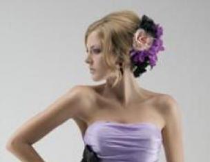
Most often in this color there is an evening dress to the floor or just below the knee made of soft flowing material. It is worth noting that for this image, our base in a dress will be quite enough, you can dilute it with other tones. To do this, you need to know what the purple color is combined with.
Another important rule is that for a dress it is better to choose accessories and additions from the same range - for example, extremely light or extremely dark. Only the use of light ornaments for the image in dark colors is allowed.
If we are not talking about an evening dress, but about an everyday one, then you can add more play with color. Feel free to combine, but do not forget about the combination rules. Take photos with bows in different tones and colors, compare them with each other and choose the most suitable options.
Also, when discussing the dress, it is worth mentioning the tunics. As an independent element of a holistic look, it can also include colors other than purple. Regardless of what colors they are, it is best to choose in this case exclusively black leggings, they will not look vulgar or defiant. See for yourself by taking different photos with black leggings and leggings of a different color.
On the red carpet
On the catwalks

Design solutions
Trousers
Leaving the theme of the dress, we will also discuss trousers, which can often be found in a purple shade. It is recommended to choose blouses of light shades for them, and, if desired, complement the bow with jackets in dark versions. If we are talking about everyday wear, then you can take T-shirts, sweatshirts or sweatshirts for an addition as a top. Remember that since purple is quite a bright shade, it needs to be smoothed out with the help of the top, so more neutral tones should be preferred.
This color is twofold and complex. It is very dangerous for temperamental individuals: an irritating purple pigment can provoke either melancholy or constant scandals. At the same time, lilac is considered the color of spiritual and creative people. He is able to make imagination work and take you to the world of castles in the air.
If you want your child to become more creative, learn to dream and fantasize, add lilac color to the interior of the nursery. Even decorative elements will be enough: bedspreads, pillows, frames, carpet.
Designers recommend using lilac in large spaces. In this case, you will have the opportunity to beat him, hiding some minority and coldness. The concentration of lilac in the room does not depend on the amount of light: the color will always look noble and sophisticated.
Perfect color combinations with lilac
For each room in the house, in a pair to lilac, certain shades should be selected. So you get a spectacular, rich interior that will delight and inspire you every day. For example, in the living room, combine lilac with milky, yellow, white, pale pink, purple. These colors can appear both in details (pillows, bedspreads, curtains), and be basic. All shades are easily combined with each other, slightly neutralizing the languor and bohemian lilac color.
You will get a spectacular interior by combining lilac with its close relative - dark purple. The contrasting combination looks very elegant. White can become a bonding color.
In the bedroom, lilac is especially appropriate. If you are a lonely romantic girl, create a room for yourself to fantasize and dream in. To do this, combine lilac with light beige, pastel pink, ivory or pearl. A more restrained, elegant bedroom will turn out if you add gold to the main color. For a couple, lilac with wood / straw will be a wonderful combination.
The kitchen is a wonderful place for a lilac color. According to the assurances of psychologists, this cold shade, along with blue and green, slightly suppresses appetite, which will help you always stay in shape. For a beautiful kitchen, a combination of lilac with silver, chocolate, peach, menthol is suitable.
Separately, it is worth noting the introduction of lilac color in the children's room. There it should be supplemented with bright, warm shades that charge with a positive. Orange, sunny yellow, coral are perfect. Lilac also combines well with blue and green flowers.
Delicate and mysterious, capricious and rebellious, the lilac color looks amazing in the interior ...
From delicate light purple to deep and rich, all variations of this amazing color can create a slightly aloof and mysterious atmosphere, no matter what style the room is decorated in. Lilac is able to give real chic to a pompous classic style, to enhance the cosmic impression of a high-tech room ... It is difficult to come up with a style in which a shade of lilac would be completely inappropriate.
The most common and reasonable combination is lilac + white. Such a pair of colors (especially if light lilac is chosen) will visually enlarge the room, make the interior fresh and delicate, but without vulgar glamor.
Combinations of lilac with soft shades of blue, red, green, yellow can be very interesting ... Even with black, if you carefully choose the shades and textures of finishing materials, furniture and textiles, the combination will not turn out as mournful as you might think.

Useful advice: if you love the classics and don't want to experiment, try combining light shades of lilac with beige or pistachio, the shade of the first spring grass or dusty blue. Combinations of this kind will not look too contrasting, but they will give the interior the necessary freshness and will look interesting.
How not to overdo it with lilac
It is widely believed that it is uncomfortable to spend a lot of time in a room decorated in lilac tones, since lilac increases anxiety. In order not to get this effect at home, do not choose too bright lilac shade of finishing materials. If you want to see lilac wallpapers in your room, do not glue them on all walls - dilute them with companion wallpaper in a calmer shade or decorative panels. Also, do not use several bright shades of lilac when decorating a room (especially if its area is small).
By the way, do not forget about the positive effect of the lilac color on a person. This color is able to awaken the imagination, stimulate performance, and improve mood.
Purple is often perceived as elegant, enchanting and mystical. At the same time, many people find it somewhat disturbing, so it is rarely used in interiors. Meanwhile, variations in purple can look extraordinarily dramatic.

Violet is born from the fusion of exciting red and cold blue, but in it their qualities are manifested to a much lesser extent. Blue extinguishes the fieryness of red, and red neutralizes the coldness of blue. Therefore, avoiding purple in the interior is absolutely not worth it. On the contrary, it is able to enhance a person's creative imagination, help him concentrate and cheer him up.
Of course, the dark purple walls in the room will look rather gloomy, but everyone can find the most pleasant shade of purple for themselves. By the way, its shades include lilac, and lilac, and purple, and lavender colors.
The combination of purple and white colors is considered the most harmonious. White softens both some of the gloom and excessive brightness of purple, giving the room a sophisticated elegance.
Most often, various shades of purple are used in the interior design of a children's room. For example, lilac is a good solution for a girl's room. Many girls prefer pink tones, but this is too much like a house for a Barbie doll. The subtle shade of lilac can be a good alternative to pink. The interior will turn out to be light and feminine, but not too cloying.
A nursery for a boy can also be made in purple tones. However, in this case, you need to choose a brighter addition for them, for example, a rich orange color.
Purple can also be used in the interior of the bedroom. He, like blue, has the ability to calm and relax. True, an excessive amount of purple can make the bedroom too gloomy, but in combination with another color it will look very impressive. Shades of purple can be used to create an art deco or country style bedroom interior.
Lavender and lilac tones are well suited for the interior of a female bedroom. They will help create a dreamy and sentimental atmosphere in her.
In living rooms, purple is not very common. Typically, it can be seen in modern versions of the Baroque, Rococo and Art Nouveau styles, where it is combined with golden or silver tones. Since purple is also considered the color of neon, it is also used in modern high-tech interiors.
Purple can also be used for upholstery, cushions, carpets and curtains.
Designers generally discourage the use of purple in kitchen interiors, as it is believed to extinguish appetite. However, if you choose such shades of purple as eggplant or plum, the room will turn out to be very cozy. Do not forget that here, as in the bedroom, purple should be combined with another color. Purple kitchen furniture also looks impressive.
Thus, purple and its many shades can become a true decoration of the interior. The main thing is not to be afraid to experiment with it.
Tip 4: Lilac wallpaper: possibilities and principles of application in the interior
Lilac is a very bold, cold color, and not everyone can decide to use it in the interior. In fact, lilac wallpaper is a great opportunity to fill rooms with mystery, create depth, use unexpected solutions to decorate rooms of any type - from an entrance hall to a bedroom and a dressing room.

Interiors decorated with lilac wallpaper are increasingly appearing on the pages of print and online publications. They look very bold, the possibilities that they give in design are simply endless, you just need to carefully consider the color and placement of accents. It is important to understand what the specificity of the color is, to be able to combine it with suitable shades, to think over the decoration of the room where the lilac wallpaper will be used, down to the smallest detail. In the art of interior design, there are certain rules, tricks and subtleties of using lilac color and its shades, a scheme for a possible combination with other colors of the palette has been developed.
How can lilac wallpaper be used in the interior
With the help of lilac wallpaper, you can radically change the interior, visually expand the space or make it compact, but deep, cozy and mysterious. Professional designers “play” with such material and create unique solutions in any style - from the classics of the English direction to the modern “high-tech”. To succeed without experience in this area, you should adhere to the following recommendations of professionals:
- in a room with poor lighting quality, only light lilac wallpaper can be used,
- if the room is small, then lilac wallpaper of a light shade is taken as a basis in it,
- in large rooms, light wallpaper will be "lost", and a rich color is needed,
- lilac wallpaper fits perfectly into any style, but classic, retro, warm Provence are preferred.
You can use lilac wallpaper as accents, but it is very important to choose the right tones for other interior elements, including furniture, textiles and accessories.
What shades can be combined with lilac wallpaper
Few people know that the lilac color in the interior was extremely popular at the time of the inception of the Baroque style. At the moment, its demand in interior design has increased again, and in the form of the most unusual and daring solutions and combinations. Lilac wallpaper can be combined with materials of the following shades:
- beige and sandy,
- gray and black,
- white and milky.
These are classic “duets” of color combinations. But you can use more daring solutions, combine lilac wallpaper with similar shades, for example, cornflower blue or lavender, orchid or lilac, amethyst, plum or eggplant.
They look good in the interior, and unusual combinations - lilac with light green, blue sea, bright red - also refresh it. Professionals recommend in such "duets" to give the lilac a secondary role, to use it as an interspersion in the main tone in the form of a panel of wallpaper, textiles or furniture elements.
Lilac wallpaper with a print - secrets of choice and use
Lilac wallpaper with a print looks very original in living rooms, spacious bedrooms and hallways, kitchens. But success is possible only if the print is chosen correctly. Professionals recommend following these rules:
- the size of the print should correspond to the size of the room, for example, in compact rooms, only a small ornament on lilac wallpaper is appropriate,
- a floral lilac pattern is a luxury, and the whole interior must match it, including furniture, accessories and textiles,
- on lilac wallpaper in a classic interior there should be an ordered drawing or pattern, and a rare single print will perfectly fit into minimalism,
- if a print is used as an accent, then its tone should be as bright as possible, if as a background it should be light.
It is important to understand that by the concept of "print" in these rules, designers mean both a small pattern on the wallpaper - embossed or drawn, and a large floral pattern. So that the result does not look vulgar and does not hurt your eyes, you can use special programs for interior design.
What premises are lilac wallpaper suitable for
With skillful use, lilac wallpaper will look good in any type of room. This shade of the color palette, although considered cold, forms an atmosphere of harmony, peace and tranquility in the room.
In the living room, you can create an interior from several shades of lilac wallpaper, delimiting with their help the main areas of the room - a work area, a recreation area, a play area for children. If the living room is decorated in one tone, then the designers recommend creating accents from a panel with landscapes in gray tones, pieces of furniture in white or bold red.
In the bedroom, do not paste over the walls with lilac wallpaper in a rich, rich tone. It is better to buy light wallpaper for this room, which creates coziness and warmth. Accents in the bedroom are not needed, border prints should not be here, that is, both furniture and textiles should be the same tone as the walls.
The dining room and kitchen are where lilac wallpapers, accessories and other interior elements will be most appropriate. Lilac can be walls, areas above worktops, furniture, dishes, tablecloths. And in these rooms, it is practically impossible to overdo it with either the quantity or the saturation of this color. But you should not forget about the limits of reason, the rules of interior design.
Basic rules for a lilac interior
So, lilac wallpapers have been chosen for the decoration of one or all rooms of an apartment, a country house or a cottage. What rules should not be forgotten in any case? They are simple and there are not many of them:
- the main tone and its combination with other colors must be thought out,
- be sure to adhere to a certain style - classic, baroque or high-tech,
- the size and type of print, if used, must match the size of the room,
- the smaller the room, the lighter the lilac wallpaper should be for it.
If this particular color is chosen, it is worth considering in detail the future interior, familiarizing yourself with the recommendations of the designers, and even better - to involve professionals in the development of the finishing project.
Red is the first high energy color... It is a hot, strong, stimulating color. It increases blood pressure, libido, quickens breathing, speeds up metabolism. The artist Avozovsky worked in a room painted red, and this stimulated his creativity. All other properties of red - the color of blood and fire - stem from its energy intensity.
Red value associated with love, passion, desire, warmth, strong desire, lust, sexuality, sensuality, romance, joy, strength, energy, activity, hard work, leadership, courage, willpower, anger, irritability, danger, stress, brightness and determination.
Red- assertive, self-confident, courageous, determined, energetic, full of enthusiasm, impulsive, exciting and challenging color. Red represents physical energy, lust, excitement, and intense desire. It symbolizes activity, self-confidence and courage. Red is associated with the most primitive physical, emotional and financial needs, survival and self-preservation. This color emphasizes materiality, materiality, symbolizes the active masculine principle.
Red- a heavy color that contains a range of emotions from passion and intense love to cruelty, enmity and war. This is the color of an angel and a devil at the same time.
This color is often used to express love as for Valentine's Day, however, it is more associated with sexuality and lust than with love - love is expressed in pink. Therefore, the place where brothels are located is called the "red light district", as in the past such lanterns were hung in front of the entrance to the aforementioned establishments.
Too much red spoils the mood, anxiety, anger, domineering, exactingness and arbitrary behavior. Too little red leads to lethargy, passivity, fearfulness, tearfulness, a feeling that you are being manipulated. If you want to get more energetic, add some red to your life.
What else does red mean?
Why does red mean danger?
Even among our distant ancestors, red was, first of all, a symbol of threat, showing itself in the fire of fires, lava of erupting volcanoes and an ominously beautiful sunset, promising the inevitable beginning of night and the rule of dark forces on earth. But most of all, the red color manifested itself in the blood of animals obtained in the hunt or sacrificed, as well as in wounded and killed soldiers. Red blood then did not symbolize life, but was life itself, because the ancient people understood that its loss led to death.
Annoying, alarming, attention-getting, red is used to indicate danger. It is suitable for painting emergency items: lifebuoy, fire fighting equipment, fire hydrant, stop crane. It painted prohibiting, warning and requiring a stop road signs and a red traffic light. Red flags or ribbons mark a dangerous location where an accident or crime has occurred. A red flag on a lifeguard tower on the seashore signals that there are strong waves in the sea and swimming is prohibited. Fire trucks and vehicles carrying explosives are also red. As one psychologist put it, the more red objects around us, the more dangerous our life becomes.
On the other hand, red denotes danger because this highly visible color can quickly focus attention and help people make quick decisions.
Red - a symbol of special achievements
Red's association with bravery and courage makes it a color often used for national flags, badges, and achievement awards. For students and schoolchildren, it also symbolizes special achievements (red diploma at school and institute).
In order to diversify the wardrobe and "paint" it, it is enough to turn to purple in clothes. Not as flashy as red, it is still very effective, and sometimes one piece of clothing or purple accessory in a simple look can give it a zest.
So what is purple in clothes combined with? The online magazine site will give you the answer and tell you how to look stylish thanks to this color.
Purple and light shades
Purple + white
In clothes, purple with white shows all its depth and brightness and looks fresh and attractive.
White, on the other hand, makes it visually appear even whiter, and for many looks, the effect of snow-white clothing is very important.
Purple + beige
Violet and beige in clothes make up a more relaxed pair; in such colors, a casual outfit or even an image for work can be made if the dress code is not strict.

With more creamy shades, purple will not look so impressive, so it is better to refuse such combinations in favor of more profitable ones. What else goes with purple in clothes?
Purple and pastel shades
The pastel palette goes well with this color, and the images can turn out to be both romantic and delicate, as well as bright and playful. For example, blue and purple in clothes will create a very reverent tandem, despite the coldness of the shades.

Even more delicate images can be created using pale pink and purple, lilac and purple. If in this color scheme you choose a dress or a blouse with a skirt, then the self-feeling of the princess is guaranteed to you. And if you opt for jeans / trousers, a T-shirt and a jacket, then declare yourself as a person with great taste.

With peach, light green, lemon, purple looks completely different. These combinations are perfect for hot days in the city or on vacation.
Purple and other colors
The combination of purple with other colors in clothes is varied, but almost always bright and sometimes provocative. Even if you like neutrality in clothes, do not pass by such juicy tandems.
Purple + yellow
Yellow and purple look very bright in clothes.

If you make a mistake with the case and the style of the outfit - it's vulgar, but this tandem is perfect for parties, cocktail dresses, summer looks.
Green + purple
The combination of green and purple in clothes is from the same opera.

Perhaps such a bold combination will not suit you according to the color type or will not go well with your individual style.
Purple + orange
Orange and purple in clothes is a classic combination in its own way.

Of course, you cannot call it universal, but in terms of saturation and brilliance there is no equal to it.
Purple + blue
Blue and purple in clothes is a completely different matter. Cold gamut, closeness of shades, actual colors - such an ensemble is doomed to success.

The combination of blue and purple in clothes will be especially good in trouser sets or jeans with some kind of tops. A geometric print will suit these colors.
Purple + red
At first glance, purple and red in clothes seem incredible, but such combinations can exist without pretending to be vulgar. More muted or darkened shades - and a mysterious and very sexy look is ready.

Even if you choose purple trousers and a shirt in red tones, a certain mood for eroticism and romance cannot be avoided. Just let the contrasting combination of purple with other bright colors be the main detail of the image - without unnecessary complications.
Purple and black
Combines purple with black in clothes perfectly. Black emphasizes the depth of color, making clothes, whatever they are, seem more effective.

In evening and cocktail versions, this combination looks elegant and chic - and unusual.
Purple and gray
Gray and purple in clothes is a good variation for casual looks, does not require complicated silhouettes and long thinking in front of the mirror, and still very stylish.

When asked what color purple in clothes is best combined with, everyone will answer for herself, based on her preferences. Therefore, try different things, love yourself and then in any color scheme you will find something for yourself * wink *